 AI WORLD HQ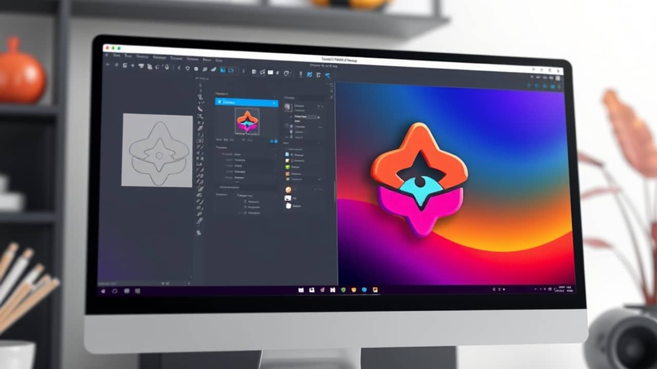
Designing a logo used to mean either learning vector tools yourself or paying a designer. Now AI tools can draft concepts in seconds. But the moment you want that logo to look sharp at every size — from a 16-pixel favicon (the tiny icon in your browser tab) to a banner on a printed sign — the file format matters as much as the picture itself.
The two-step workflow Recraft describes
According to Recraft's own guide on using V4.1 for logo design, the process is split into two stages:
- Early concept rounds on a raster model. A raster image is the kind made of pixels — like a regular photo. It's fast to generate and easy to compare lots of ideas side by side, which is what you want when you're still exploring.
- The final mark in Recraft V4.1 Vector. When you have a direction you like, you generate the final version in V4.1 Vector, the AI model that returns a vector file instead of a pixel image.
The split matters because the two stages need different things from the AI. Early exploration rewards speed and variety. The final mark rewards precision.
Why the vector output matters
The output of V4.1 Vector is an SVG (Scalable Vector Graphics) — a file built from mathematical lines and shapes rather than a grid of colored dots. That single difference changes how the logo behaves everywhere it appears:
- A favicon — the 16-by-16-pixel icon in your browser tab
- A website header at full size
- A printed sign on a wall or storefront
All three use the same file. None of them "go soft at the edges" — the term Recraft uses to describe what happens when a pixel-based image is scaled beyond its original size and starts to look blurry.
If you've ever tried to use a regular photo as a logo, you've seen this. The image looks fine on your phone, then turns fuzzy when you stretch it across a website header. A vector file sidesteps that problem because the lines are redrawn at whatever size you need them.
What to keep in mind when generating logos with AI
A clean SVG is a real advantage, but it's not the whole job. A few things worth thinking through before you commit to an AI-generated logo:
- Check it at small sizes. Logos live everywhere from app icons to embroidered shirts. Shrink your design to favicon size before you fall in love with it — if the shape still reads, you're in good shape.
- Mind uniqueness and trademarks. Just because the AI produced it doesn't mean no one else has a similar mark. A quick search before you commit can save you a real headache later.
- Keep the editable source. Once you have a final SVG, save the version Recraft gave you. If you ever want to tweak a curve or change a color, you want the editable file, not just a flattened export.
Wrap-up
Recraft's V4.1 workflow for AI logo design is built around a simple split: rough out ideas with a raster model, then switch to V4.1 Vector for the final mark. The payoff is a single SVG file that holds up at every size you'd realistically need. If you've been holding off on AI logo tools because the output looked blurry when scaled up, that's the specific problem this approach is designed to solve. A reasonable first step today: generate a few rough concepts, pick the one direction you like, and see what the Vector version looks like shrunk down to favicon size.