 AI WORLD HQ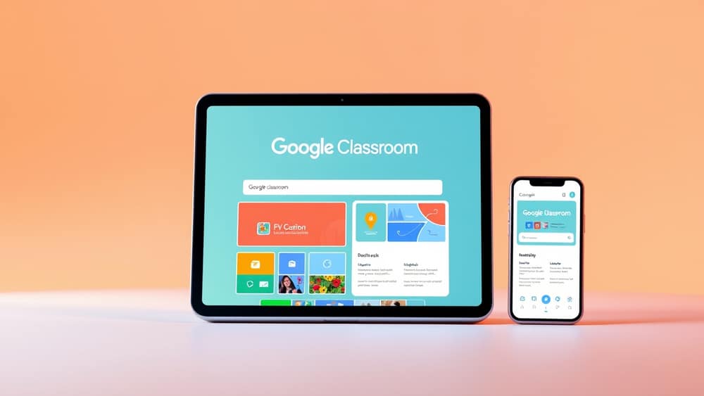
How the New Google Classroom Homepage Works for Teachers, Students and Parents
Picture this — it's 7:45 in the morning, you're halfway through your coffee, and you open Google Classroom (a free Google tool that helps teachers run classes online and helps students keep track of homework) to find today's lesson. The homepage looks different. Nothing is where you remember it. Before you panic, here's the good news: the redesign is meant to make things easier, not harder.
Google has been rolling out a redesigned Classroom homepage that puts the right tools in front of the right people. The big idea is simple — instead of one homepage for everyone, you now see a view that's tailored to your role. Here's how to make sense of it.
What's actually changing
The old homepage was a bit like a shared kitchen drawer. Everyone rummaged through the same pile looking for what they needed. The new design sorts things into clear sections, so teachers, students, parents and school administrators each get a homepage that suits their day.
Your classes are still where you left them — on the left-hand side navigation panel and in a dedicated classes module on the homepage. Nothing has been removed; it's just been rearranged so the most useful tools surface first.
How the role-based view works
When you log in, Classroom decides what to show you based on your role. This is what people in tech call a role-based interface — a fancy way of saying "different views for different jobs". The same idea is used in workplaces, banking apps, and even some streaming services.
Here's a quick breakdown of who sees what:
- Teachers see upcoming assignments to mark, recent class activity, and quick links to create new work or announcements.
- Students see what's due soon, recent feedback, and a shortcut back to their class stream.
- Parents and guardians see a summary of their child's upcoming work, recent feedback, and any announcements teachers have shared. If you've used Classroom before, this view makes it much easier to check in without digging through menus.
- Administrators (the people who run the school or organisation) see overviews across many classes at once, plus tools for managing users and settings.
Everything is still searchable from the side menu, so if you ever can't find something, that's the first place to look.
A few practical tips to try first
Here are three small habits that will save you time once the new homepage lands:
- Spend a minute exploring. When the update arrives, click around a little before going back to your old routine. You'll find the new shortcuts faster than you think.
- Use the classes module on the homepage. Your classes are surfaced there, so the ones you open every day are only a click away.
- Make the "due soon" area your morning check-in. If you're a student, this becomes your new one-stop view for the day. If you're a parent, it's the easiest way to spot what's coming up this week.
Wrap-up
The new Google Classroom homepage is less about flashy changes and more about putting the right tools in front of the right person at the right time. Once you spend a minute exploring it on day one, your old routine will adapt quickly. Try logging in tomorrow and clicking on three things you've never tried before — that's the easiest way to find a small time-saver you'll use all year.